
Whether you run a personal blog, an e-shop or a business platform, a well-designed contact form is often the primary bridge between visitors and owners. It not only enables communication but also builds credibility, improves user experience and increases conversions.
A contact form website is more than just a page with fields and a submit button. It represents professionalism, trust and availability. When properly implemented, it can significantly improve customer satisfaction and streamline communication processes. This article explores everything you need to know about form websites, from their importance and design principles to SEO benefits and best practices.
What is a website with a contact form?
A contact form website refers to a website that contains a structured form that allows users to send messages directly to the website owner or organisation. Instead of publicly displaying the email address, the contact form securely collects user information and messages and delivers them to the appropriate mailbox.
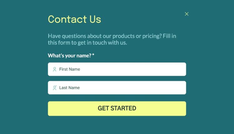
Most contact forms include fields such as name, email address, subject, and message. Advanced forms can also include drop-down menus, checkboxes, file uploads, or auto-responders. These forms are usually located on a dedicated “Contact Us” page, although many websites also integrate them into landing pages, footers or pop-ups.
Why is a website with a contact form important?
A website with a contact form offers many benefits to both users and website owners. Simplifies communication while maintaining control over incoming enquiries. From a business perspective, it also helps organise leads and filter relevant messages.
The main reason why contact forms are preferred is their convenience. Visitors can quickly send a message without having to open an email client or copy addresses. This ease of use encourages more people to reach out, increasing engagement opportunities.
In terms of security, contact forms protect email addresses from spambots. Instead of publishing an email, the form acts as a secure intermediary that reduces spam and junk messages.
How contact forms improve user experience
User experience is a major factor in the success of a contact form website, and contact forms contribute significantly to it. A well-designed website with a contact form ensures that visitors feel heard and supported.
A clear and simple form assures users that their message will reach the right person. When combined with confirmation messages or auto-reply emails, it increases trust and professionalism. Visitors appreciate that their query has been received and will be addressed.
A positive user experience also comes from accessibility. Mobile contact forms make it easy for users to communicate from any device. As more and more users browse on smartphones, responsive form design is no longer optional.
SEO Benefits of a website with a contact form
Many website owners underestimate the SEO value of a website with a contact form. While contact form website themselves don’t directly improve rankings, they do contribute indirectly in several important ways.
Search engines value user engagement and trust signals. A functional contact page demonstrates legitimacy, which can improve overall website credibility. Websites with transparent communication channels are often perceived as more trustworthy by users and search engines.
A well-optimised contact page can also be rated for brand or service enquiries. By naturally including relevant keywords in headlines and content, a contact form webpage can attract targeted traffic.
Some SEO benefits include:
- Improved signals of trust and credibility
- Lower bounce rate due to better user engagement
- Increased conversions from organic traffic
Basic elements of an effective website with a contact form
Creating an effective contact form website requires careful planning. The goal is to facilitate communication while collecting only the necessary information.
The most successful contact forms are short and simple. Asking for too much detail can overwhelm users and reduce submission rates. Each field should serve a clear purpose.
Visual cleanliness is also essential. Labels should be easy to understand and error messages should be helpful rather than confusing. A clean layout encourages users to fill out the form without frustration.
The key elements of any contact form web page should be:
- Clear form labels and placeholders
- Visible submit button with action-oriented text
- Confirmation or success messages after submission
Best practices for designing contact form websites
Design plays a key role in how users perceive and interact with a contact form website. A poorly designed form can discourage communication, while a well-designed one can instantly increase trust.
Simplicity should always be a priority. Avoid unnecessary embellishments or distractions around the form area. White space helps users focus on the task of filling out the form.
Another important factor is location. The contact form should be easy to find. Most users expect it in the main navigation menu or footer. Some websites also place quick contact forms on high traffic pages.
Security features such as CAPTCHA or spam filters are also essential. They protect the form from automated abuse while ensuring that real users can submit messages without problems.
A website with a contact form for companies and professionals
For businesses, a contact form website acts as a digital receptionist. It collects questions, support requests, partnership proposals and feedback in an organised way.
Professional websites often customise their contact forms according to purpose. For example, sales enquiries may go to one department, while support messages go to another. This improves response time and efficiency.
Contact forms also help businesses qualify leads. By including fields such as company name or service interest, businesses can prioritise high-value enquiries and respond accordingly.
Common Mistakes to Avoid on Contact Form Websites
Despite their simplicity, contact forms are often implemented incorrectly. These errors can lead to lost messages, frustrated users, and missed opportunities.
One common mistake is asking for too much information. Long forms feel intimidating and reduce submission rates. Another issue is unclear error handling. If users don’t know why their form failed, they can abandon it altogether.
Ignoring mobile optimisation is another big mistake. A website with a contact form that doesn’t work well on smartphones risks losing a large portion of potential contacts.
Other mistakes to avoid include:
- No confirmation message after submission
- Broken or broken form elements
- Poor contrast or illegible text
Website contact form and building trust
Trust is a critical factor in online interactions, and a contact form website plays a direct role in building it. When users see a professional contact page, they feel more confident about the legitimacy of the website.
Including additional information near the contact form, such as business hours or location, can further enhance trust. While not mandatory, these details reassure users that real people are behind the website.
Privacy assurance is also important. A brief note explaining how user information will be handled can increase confidence and encourage form submissions.
Advanced Features for Modern Form Websites
Modern contact form websites often go beyond basic functionality. Advanced features can improve efficiency and user satisfaction.
Automation is a popular feature. Auto-response emails confirm receipt of messages and set expectations for response times. Some systems also integrate with CRM tools to manage leads effectively.
Conditional logic is another advanced option. It shows or hides fields based on user selections, keeping forms short and relevant. This enhances user experience without sacrificing data quality.
Conclusion
A contact form website is an essential component of any successful online presence. It serves as a direct communication channel, improves user experience, and strengthens trust between website owners and visitors. When designed thoughtfully, a contact form can increase engagement, reduce spam, and support business growth.
By focusing on simplicity, clarity, and accessibility, you can create a form website that meets user expectations and aligns with SEO best practices. Whether you are building a personal site or managing a large business platform, investing time in optimising your contact form will deliver long-term benefits.
Frequently Asked Questions (FAQs)
What is the main purpose of a form website
The main purpose of a form website is to allow visitors to communicate easily with the website owner while keeping email addresses secure and organised.
Is a contact form better than displaying an email address
Yes, a contact form is generally better because it reduces spam, improves user experience, and helps organise incoming messages efficiently.
Can a form website help with SEO
Indirectly, yes. A form website improves trust, engagement, and credibility, which are important factors for overall SEO performance.
How many fields should a contact form have
A contact form should have only essential fields. Typically, name, email, and message are enough for most websites.
Are contact forms safe for collecting user data?
When properly secured with validation and spam protection, contact forms are safe and reliable for collecting user enquiries.